How accurately can we recall logos we see on a daily basis? It sounds like an easy question at first. However, a recent study by signs.com found that only 16% of people were able to draw near perfect logos. Let's see how our designers faired!
Our design team decided to challenge themselves with the same experiment. With the help of us (the marketing team), we selected 10 well know logos and asked our design team to draw the logos from memory. The results were... interesting!
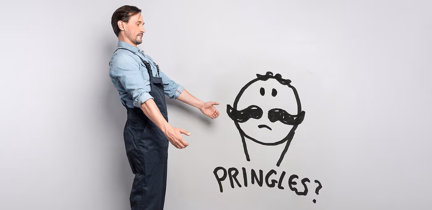
Let’s Start With Burger King
The Burger King logo was originally unveiled in 1967 and has virtually remained unaltered since. The brand colours were specifically chosen to help “build a striking and memorable brand, which helps to attract people from far and wide” For the purposes of this challenge, this was an interesting example, of trying to bring together the different aspects of the logo together from memory. All of the team were able to remember the colours, thanks to some excellent colour choices, as mentioned above. They were also able to remember, the shapes that made up the logo, such as the shapes of the two buns, the burger and the text. Well done Burger King, we salute you.

Snapchat
The co-founder of Snapchat, Evan Spiegel, admitted that he drew this logo in his University Halls of Residence and chose the yellow colour, because no other brand at the time had this colour For this experiment, the friendly ghost branding was easily remembered across the board, bar a few minor details. This may be in part that our designers all within their target age bracket, however, it shows that simplicity trumps intricacy, in the memory war.

Pringles
The basis was there across the board and all of the team were able to easily remember Mr. Pringles. However, two of our designers admitted they got confused with Mr Monopoly, who equally has a moustache and bow tie.
Virgin
Our team told us that this was fairly easy to remember and this was likely due to the logo being text-based, with a large V. However, there are little details missing, such as the little tick on the end, the tail of the ‘g’, and the ‘swoosh’ (as we like to call it) underneath.
……This is where we started to make things a little bit harder!
British Gas
The basis was remembered across the board. This was believed to be due to their various marketing campaigns. Again, this is a logo that is text-based and is decorated with the addition of the flame. The flame was the area which our team struggled with, both the shape of it and the order of the logo. Interestingly, when one of our designers looked back, they realised they remembered the old logo, more than their new one. However, in large part the details were there, so we’d give this a thumb up.
Nissan
A bit of a tough one and was a bit of a mixed bag across the team. The Nissan logo is reportedly one of the most ‘instantly recognisable car logos in the world’. The current logo was introduced in 2001 and consists of a modern rework, of the original red and blue logo in a sophisticated a silver finish. One team member said they struggled to remember this and it came together as a combination of Hyundai and SEAT (whoops!).
Cadbury’s
You may have just thought ‘Cadbury’s’ that’s easy, however, don’t be fooled! Can you remember the intricacies of the logo? Did you think two half milk glasses were included too? Well, this is reportedly quite common! Our team also had the same experience, with 2/3 remembering the Cadbury Dairy Milk branding and merging this with the overall Cadbury branding.
Nando’s
Nando’s was rebranded in 2016, to help forge a stronger connection to its roots. The chain has taken over the UK and everyone can easily recall the chicken based menu. However, the intricacy of the logo is hard to replicate, with one team member commenting it looked more like a ‘headless burnt chicken’. If their branding is too detailed to remember, the point could be raised, that it’s time to rebrand, to a more streamlined logo.
Tesco
The Tesco logo was unveiled in 1996 and was designed to incorporate the colours of the British flag. With the red, symbolising prosperity, the blue representing excellence and the white conveying nobility. There are a few reasons we think our team did pretty well on this one. The first, Tesco is one of the most instantly recognisable logo’s in the UK. Second, it’s also pretty local to our office. Third, it is again, another simple, text-based logo. All three found this easy to remember and were all able to make some decent attempts. Another thumbs up here.
Barclays
This one was a tough one. Although Barclays do have a text-based logo, it is finished off with the “spread emblem” of Barclays. This actually dates back to the 17th Century, when Barclays was originally founded and when very few people could read. So, it was quite common for business owners to use pictorial signs to brand their business. However fast forward, four Centuries the spread emblem, with a new simplified version released in 2004 is still quite difficult to remember. All three of our designers were able to remember the text and the prominent blue colour, but struggled to remember the detail of the crest.
Overall, the shapes and elements in logos are harder to recall, whereas the simpler logo’s such as Snapchat or the text-based logos, such as Tesco were much easier to remember easier.


