UKIP’s new branding was recently unveiled at the party conference by Interim Party Leader, Steve Crowther and was immediately met with much ridicule. At Creative Pod, branding is our bread and butter. So, we sat down as a team to review the recent UKIP rebranding.
From Steve Crowther’s speech, this rebrand has been in the wings for some time, with Steve talking anecdotally of a time when Nigel Farage asked him what he thought of the UKIP brand. Steve, retorted that he thought it was “outdated, clunky and old-fashioned”.
The challenge UKIP face now is around the post Brexit referendum and as Steve put it the ‘post Farage era’ which he states, “was always going to be difficult but necessary”. Now we are getting out of the EU, there is widespread belief that UKIP has no purpose’.
Let’s give credit where credits due, the rebranding process does seem to have been done properly (whether you agree with their policies or not) with a thorough brand review. With at the UKIP annual conference in Torquay, the unveiling of their new core brand values, which stated themselves ‘as a party which ‘does not seek power for its own sake, if we did we would be the liberal democrats’. Their brand positioning was updated to reflect them as a ‘nationalist and integrationist party. As well as this they unveiled their new mission statement “when we have regained our sovereignty, we need to have the self-confidence to be able to do something useful with it”.
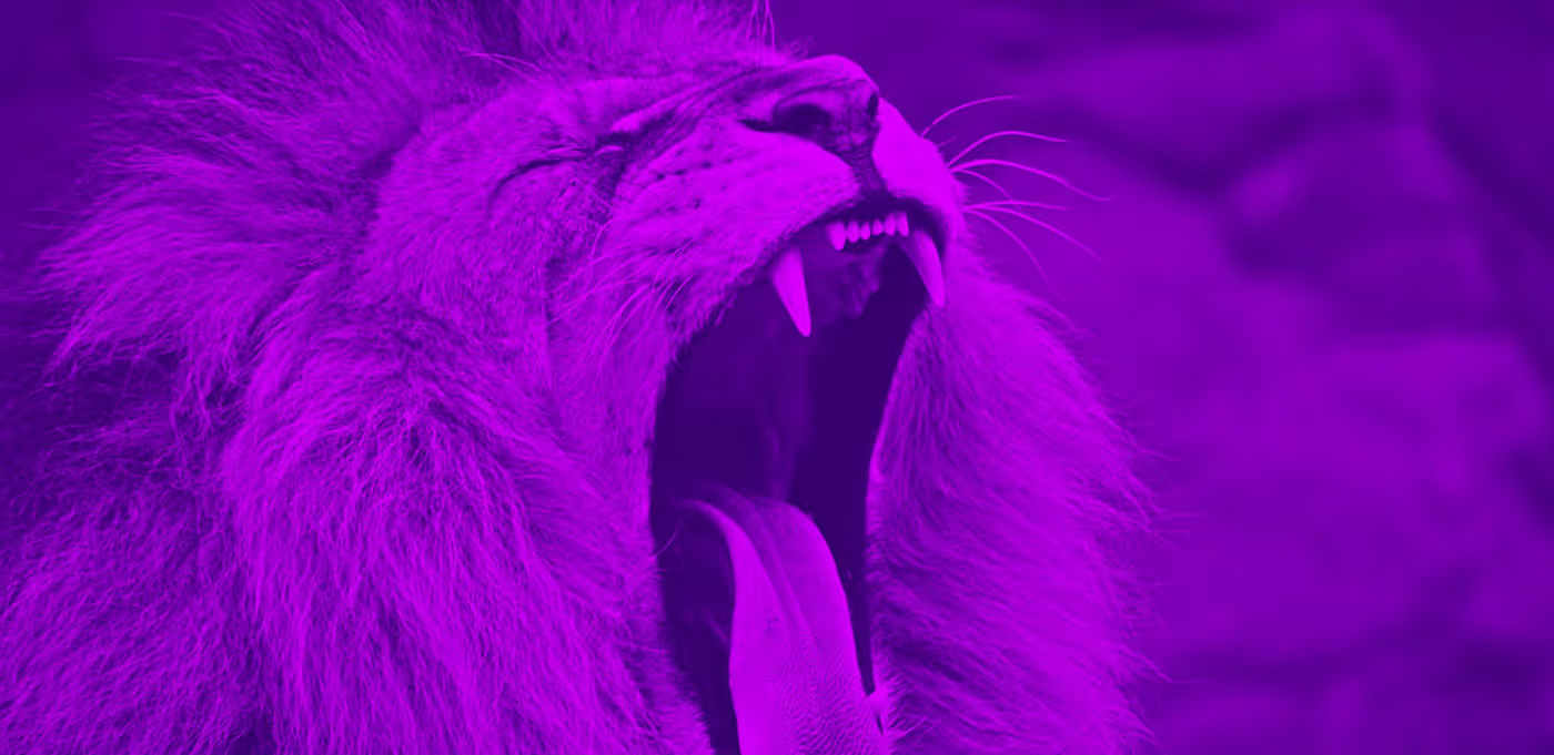
That’s enough said about the messaging, let’s move onto the general look and feel. Their new brand direction replaces the aesthetically cheap pound sign logo, that gained a possible stigma during the party’s infamous ‘Farage era’. The original branding was described as ‘a clearly defined promise, different from that of everybody else’. The new brand introduces a lion, a very familiar icon in British culture known to represent something fierce, strong and independent. It is understandable why the Lion was chosen, in some sort of attempt, to give UKIP a stronger symbolic link to Britain. Despite the odd design choice of having the poor lion looking slightly dazed and confused!
The criticism certainly didn’t stop there, eagle-eyed members of the public including Gary Lineker, were quick point out the unmistakable similarities between the UKIP lion and the Premier League lion (introduced in their comprehensive rebrand last year). Chosen by the UKIP’s party members, the unlikely imitation has caused the premier league to consult its legal team on the matter. However, UKIP rebutted that their party has verified that their new logo does not infringe on any copyright and commenting “we’re not that stupid”….So it will be interesting to see how this unfolds.
As Steve Crowther correctly said himself a brand review means, ‘looking very hard at yourself and asking who are we, what do we stand for and what are we trying to achieve’ Now the government has delivered the Brexit referendum, UKIP see it as their role to make sure the government deliver, and to answer the question on many peoples lips ‘what is UKIP beyond the Brexit mission’. This rebrand was meant to be the answer to that question and provide a new direction. However, from what we can see it seems they are going for something relatively ‘safe’ from a brand perspective, but arguably not from a legal perspective.


